Color, Light, and the Psychology
of Internet Marketing
“The eye is the organ of sight in humans and transforms light waves into visual
images and provides 80% of all information received by the human brain.“
By using color psychology, you can send a positive or negative message, increase or decrease sales, provide a calming effect over an audience, even make athletes work harder.
Colors have a very powerful and multi-level impact on human behavior. They can function in practical ways and help us to make sense of things, such as stopping at a red light or finding our way through a website purchase. At the same time, they trigger our emotions and influence the way we think, feel, and act.
Choosing the right colors is probably the most important aspect when creating a website. Backgrounds, navigation, logos, buttons and all the graphics the visitors encounter will immediately cause the brain to react and respond.
Color is a Powerful Psychological Tool
Studies have confirmed that color influences decisions to purchase and has these other effects on your website traffic:
- Grabs attention
- Causes Distractions
- Causes pain within the nerves of the eye
- Creates a positive or negative perception
- Triggers the brain into distractions
- Affects purchasing decisions
- Affects moods
- Can alter the image or perception
- Stimulates senses
- Determines conceptual intentions
- Affects Peoples sensuous desires
Determining the best color pallet for your website
For most businesses,the purpose of a website is either to sell something or cause the visitor to request more information through a lead form or suggest the visitor to take an action that will lead to a customer purchasing decision. To get the visitors interested, you must satisfy their information needs as the visitor progresses through the buying cycle.
The colors and the graphics are the first thing your visitor sees and if the selection is wrong, you will evoke the wrong perception and emotions causing the visitors to leave your website.
Meaning, the background color, the color of the header, the color of the text, the headlines and imagery – all have a psychological impact on the website’s visitor and are associated by viewers differently based on societal and cultural conditions.
Before People Will Buy From a Website
In most sales cycles, rapport is the first step and must occur before a customer is going to buy from you. When you’re on the Internet, you are not able to build rapport through face to face interactions with your visitor. If they don’t like you, they will not buy from you.
Websites are both a visual and psychological medium; so you must transmit information differently based upon your customers needs. The copy of the website has the 2nd greatest psychological impact on the visitor.
Websites are both a visual and psychological medium.
The copy of the website is the most important communication tool for your business but you will not be able to communicate if the design does not appeal to the visitor.
Internet Marketing Experts agree that repeating the same colors throughout the entire website produces visual consistency. Some may consider this repetitive and boring; but it has a purpose of building trust and reassuring your visitors that they are still in the same website as the page they entered from.
Directing EYE Movement
Creating white space on a page guides eye movement and makes an image standout. On a crowded page, eye movement moves in a circular motion around and around on the page. This causes people to feel lost and frustrated because they cannot find what they are looking for. 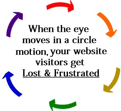

When the eye moves in a circular motion-almost aimlessly or without purpose and direction, your visitors will abandon your website because they are not finding what they are searching for.
The color and imagery should cause the eye to move in a downward direction, from left to right, into the calls to actions (CTA). Calls to Action are the desired action or goal you want your visitors to take. It is absolutely important to get the color selection correct or your CTA’s will not be visible.
When deciding on colors for internet marketing purposes, you must take into consideration the target audience in order to appeal to them. This requires Customer Profiling; providing the most relevant experience and information based on the target audience.
For example, if your customer profile is customers in lower socio-economic standing, then your website should focus on primary colors.
If you are selling financial based products, building trust starts with colors of blue, black, grey & white. Neutrals and pastels are more appealing to upscale visitors while colors like green and orange appeal to exciting, energetic products and services.
How Light Effects the Human Eye
With websites, you must first understand that your visitors are not just viewing color, they are actually perceiving light projected out of the computer screen.
The ability of the human eye to distinguish colors is based upon the varying sensitivity of different cells in the retina to light of different wavelengths.
Humans are trichromatic; the retina contains three types of color receptor cells or cones. Light is a composition of wavelengths and the human eye reduces all light into three color components.
For each location in the visual field, three types of cones yield three signals based on the extent stimulated. These amounts of stimulation are sometimes called tristimulus values.
The other type of light-sensitive cell in the eye, the rod, has a different response curve. In normal situations, when light is bright enough to strongly stimulate the cones, rods play virtually no role in vision at all.
On the other hand, in dim light, the cones are under stimulated leaving only the signal from the rods, resulting in a colorless response. Furthermore, the rods are barely sensitive to light in the “red” range. In certain conditions of intermediate illumination, the rod response and a weak cone response can together result in color discriminations not accounted for by cone responses alone.
These effects describes the change of color perception and pleasantness of light as function of temperature and intensity.
How the Eye Perceives Light
Signals sent from the photoreceptors travel along nerve fibers to a nerve bundle which exits the back of the eye, called the optic nerve. The optic nerve sends the visual signals to the visual center in the back of the brain where the experience of vision occurs.
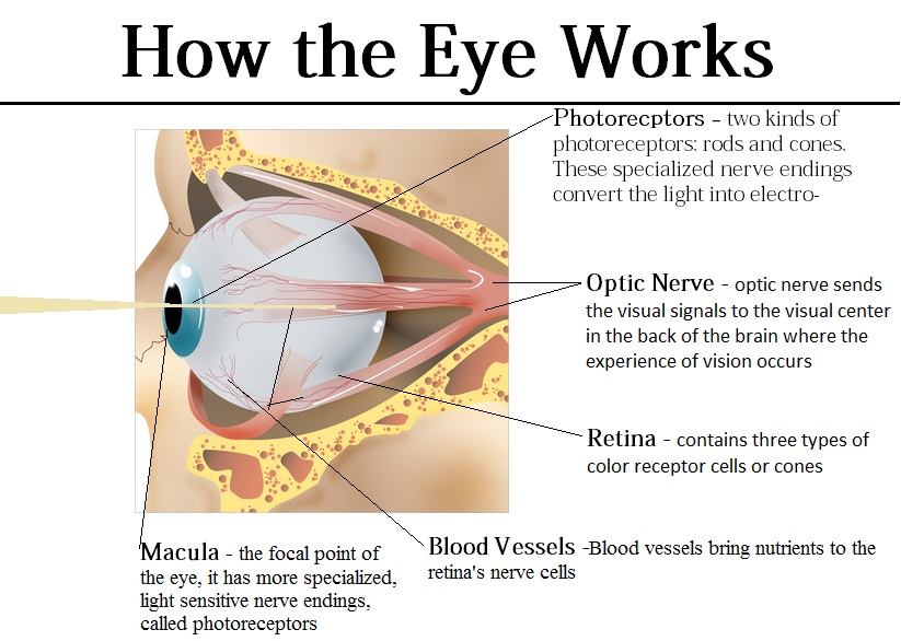

Opponent Process Theory
The Opponent Process theory has been supported by neurobiology, and describes the structure of our subjective color experience. Specifically, it explains why humans cannot perceive a reddish/green or yellowish/blue. Opponent Process theory is the predictor of the color wheel: the collection of colors for which at least one of the two color channels measures a value at one of its extremes.
The exact nature of color perception beyond the processing already described, and indeed the status of color as a feature of the perceived world or rather as a feature of our perception of the world, is a matter of complex and continuing philosophical dispute.
How Light Effects the Human Brain
Now light, reflected from an object, has entered the eye, been focused, converted into electro-chemical signals, delivered to the brain and interpreted or “seen” as an image.
The color opponent process is summed up by stating the human visual system interprets information about color by processing signals from cones and rods in an antagonistic manner.
If the color and light projected trigger the nerves in a negative manner, this will likely lead to pain signals. If you cause the eye to pain, your traffic will leave the site because it is painful to view. Its best compared to looking at the sun. Websites can trigger the same sort of sensation as if you were to look directly at the sun.
Graphic Art and Website Design
When it comes to website and graphic design, a general rule of thumb is to create the site/page as simple as possible. You do not need an elaborate design and an over abundance of colors. You need a design that directs eye movement as quickly as possible into the calls to actions.

A design that the visitor can quickly identify as what they are looking for.
Using complementary colors is an important aspect based on how the eye views light. Humans View Light Subjectively
- Black vs White
- Blue vs Yellow
- Green vs Red
It is important to remember that it is extremely difficult on the eye to view white font on a black background. A light color background with dark colored font always leads to a greater number of website conversions.
On an graphic design color wheel, complementary colors are placed opposite one another. Although these artistic complements may not be 100% precise complements under scientific definition, color wheels are typically laid out roughly like the color wheel shown to the right.


